[Day 14] User Gallery: 來曬一下你的相片集!
大家出門去玩的時候,多少會拍下一些相片,其中有些特別值得紀念的相片,這時候就可以考慮製作個自己的相片集來呈現~ 今天我們來實作Day #13
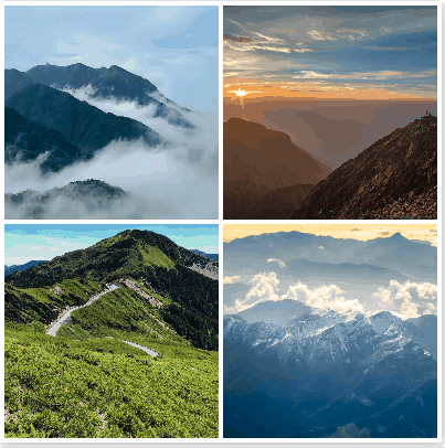
相簿的相片皆取自於Unsplash Unsplash有世界各地的攝影師或是民眾們拍的高畫質相片,供使用者免費使用,是個許多人找相片素材的地方。此次相片集的地點均在台灣,主題為山,作者的部分以Unsplash Photographers概括。
CodePen: https://codepen.io/stevetanus/pen/BaxZEXG
1.HTML
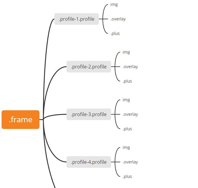
一開始我們會看到四張照片(.profile),滑鼠滑過時會有遮罩效果(.overlay),並顯示加號(.plus)
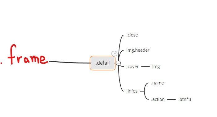
按下加號後,我們會看到一個叉叉(.close)一張背景圖片(img.header)、一個大頭貼(.cover)、作者資訊(.name)和更多動作(.action)
這邊特別介紹img標籤,一定要包含src跟alt兩個屬性,src指向相片的url,alt則為相片失效時的文字。
- HTML img tag: https://www.w3schools.com/tags/tag_img.asp
2. SCSS(CSS)
.profile(四張照片)
.frame {
  ...
  position: absolute;
  display: flex;
  flex-wrap: wrap;
  align-content: flex-start;
  .profile {
    position: relative;
    margin: 4px 0 0 4px;
    width: 194px;
    height: 194px;
    cursor: pointer;
}
.frame設定為flexbox,flex-wrap: wrap使得相片在超過.frame的寬度時,會跳到下一排,而align-content: stretch,我們將它改為align-content: flex-start使得兩排之間沒有空白,在.profile裡面再使用margin: 4px 0 0 4px製造出每個相片上方跟左方的margin,讓四張相片完美的在寬長400px的正方形中排列。
- remove flex wrap gap between rows: https://stackoverflow.com/questions/38084835/removing-large-gap-between-rows-in-flexbox-layout
img
img {
    object-fit: cover;
    width: 100%;
    height: 100%;
  }
img設定object-fit: cover會依照設定的寬長剪裁相片,並保持原本相片比例。
.overlay(遮罩)
  .overlay {
    position: absolute;
    top: 0;
    bottom: 0;
    right: 0;
    left: 0;
    background: #000;
    opacity: 0;
    transition: all 0.6s ease-in-out;
  }
.overlay設定為絕對屬性,上下左右皆設為0,完整蓋住.profile,在hover的時候會加上opacity: 0.4,讓相片產生遮罩效果。
.plus(加號)
.plus {
    position: absolute;
    width: 50px;
    height: 50px;
    top: 50%;
    left: 50%;
    margin: -25px 0 0 -25px;
    background: $red;
    transition: all 0.4s ease-in-out;
    opacity: 0;
    transform: scale(2);
    &:before {
      position: absolute;
      content: "";
      width: 14px;
      height: 2px;
      top: 24px;
      left: 18px;
      background: #fff;
    }
    &:after {
      position: absolute;
      content: "";
      width: 2px;
      height: 14px;
      top: 18px;
      left: 24px;
      background: #fff;
    }
.plus為在.profile中的正方形,使用偽元素形成加號,在hover時,會設定opacity: 1跟transform: scale(1)的屬性,使其有收斂顯現的感覺。
.detail
.detail的內容一開始會在.frame的外面,我們透過translate3d改變Y軸數字來先隱藏內容,再加入.active的class時,會有背景圖片、個人圖片、叉叉滑下來,以及個人資訊滑上去。
.detail {
  ...
  z-index: 2;
  overflow: hidden;
  pointer-events: none;
  font-size: 0;
  &.active{
    pointer-events: all;

    .header {
      transform: translate3d(0, 0, 0);
      transition: all 0.6s ease-out;
    }

    .cover {
      transform: translate3d(0, 0, 0);
      transition: all 0.6s ease-out;
    }

    .infos {
      transform: translate3d(0, 0, 0);
      transition: all 0.6s ease-out;
    }
    // background會在0.3s從紅色轉為白色,transform的動畫會慢0.6s開始
    .close {
      transform: rotate(45deg) translate3d(0, 0, 0);
      transition: background 0.3s ease-in-out, transform 0.6s ease-out 0.6s;
    }
  }
.header(背景圖片)
.detail加上.active後,所有元素都會移動到(0,0,0)的位置,我們以.header(背景圖片)為例:
.header {
    width: 400px;
    height: 200px;
    object-fit: cover;
    transform: translate3d(0, -100%, 0);
    transition: all 0.6s ease-in 0.4s;
  }
背景圖片占了.frame的一半,原本的位置為(0, -100%, 0)看不見,在.detail加上.active時,才會出現在位置(0,0,0),而.active被移除時,也會有離開的動畫,等候0.4s,在0.6s的時間回到(0, -100%, 0)
.infos(資訊欄)
.infos則是會從下面往上顯現:
.infos {
    box-sizing: border-box;
    background: $red;
    height: 200px;
    padding: 67px;
    transform: translate3d(0, 105%, 0);
    transition: all 0.6s ease-in 0.4s;
  }
.infos為.detail的下半部,在.detail加上.active時,會從原本的位置(0, 105%, 0)來到(0, 0, 0),與上面的背景圖片連接在一起,而.active被移除時,也會有向下離開的動畫。
3. JavaScript
由SCSS的屬性知道,.active為開闔個人資訊的關鍵:
let	detail = document.querySelector('.detail');
let profiles = document.querySelectorAll('.profile');

profiles.forEach( profile => * {
	profile.addEventListener("click", () =>{
		detail.classList.add('active');
	} )
})

let closeBtn = document.querySelector('.close');

closeBtn.addEventListener('click', function() {
    detail.classList.remove('active');
});
在每一張相片(.profile)點擊時,都會在.detail加上.active的class,使得個人資訊出現,而個人資訊頁面的叉叉按鈕被點擊時,會移除.active的屬性,回復到相片集呈現相片。
打包帶走(take away)
HTML
| 目標 | 屬性 |
|---|---|
| img tag | url, alt為必須屬性 |
| CSS |
| 目標 | 屬性 |
|---|---|
| flex-wrap的中間空白消除 | align-content: flex-start |
| 保持寬長與相片比例 | object-fit: cover剪裁相片 |
| 遮罩 | color: #000加上opacity: 0到opacity: 0.4的hover動畫 |
| 加號 | transform: scale(2)到scale(1),opacity: 0到opacity:1達到收斂出現 |
| 雙向動畫 | JS控制.active去達到雙向動畫,兩邊都可以設置transition來形成不同效果 |
後記
User Gallery的原作者的範例是使用float去排版,因為Thibe小弟弟我學藝不精,尚未接觸過float,未來有機會再去碰碰,就繼續用flex排版,也是從中學習到一些小眉角,原本感覺四四方方的應該很好排吧,其實卻不然。這小小的相片集其實也是富有美感的,從遮罩跟加號的運用再到切換個人頁面,全是細節,讓我也很感嘆竟然在2016年我還是高中生的時候,就已經有這麼厲害的網頁設計,現在起步能學習的東西實在好多!